
Page 16 - Visual Corporate Identity Manual
P. 16
2 ı The brand and its application
Logo
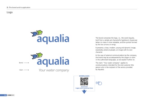
The brand comprises the logo, i.e., the word Aqualia,
built from a simple yet characterful typeface in lowercase
letters to make it more relatable, and the symbol formed
by the two arrows or wings.
It presents a close, modern, young and dynamic image,
essentially aimed at people; an image with its own
character.
In the case of external communications by the company,
the brand may be accompanied by the slogan or claim
in the authorised languages, as we explain further on.
Brand The claim “Your water company” applies to
communications intended for the end customer (the
person who is the recipient of the service provided
Claim Your water company by Aqualia).
DOWNLOADS
Download
Logos and resources here
16 VCIM2023